
Vodafone — TOBi Single UI
As a Senior Product Designer, I worked on unifying TOBi's (Vodafone's digital assistant) interface across multiple global markets. The goal was to move from a fragmented set of local implementations to a single, scalable UI that could be consistently used and adapted across regions, while staying aligned with Vodafone’s design system.
Problem
TOBi exists across multiple markets, but each implementation had diverged over time, leading to inconsistencies in UI, interaction patterns, and overall user experience. This created several challenges:
Inconsistent experiences for users across regions
Duplication of design and development effort
Difficulty maintaining and evolving the product at scale
Misalignment with Vodafone’s central design system
There was a clear need to bring everything together into a more unified and scalable approach.
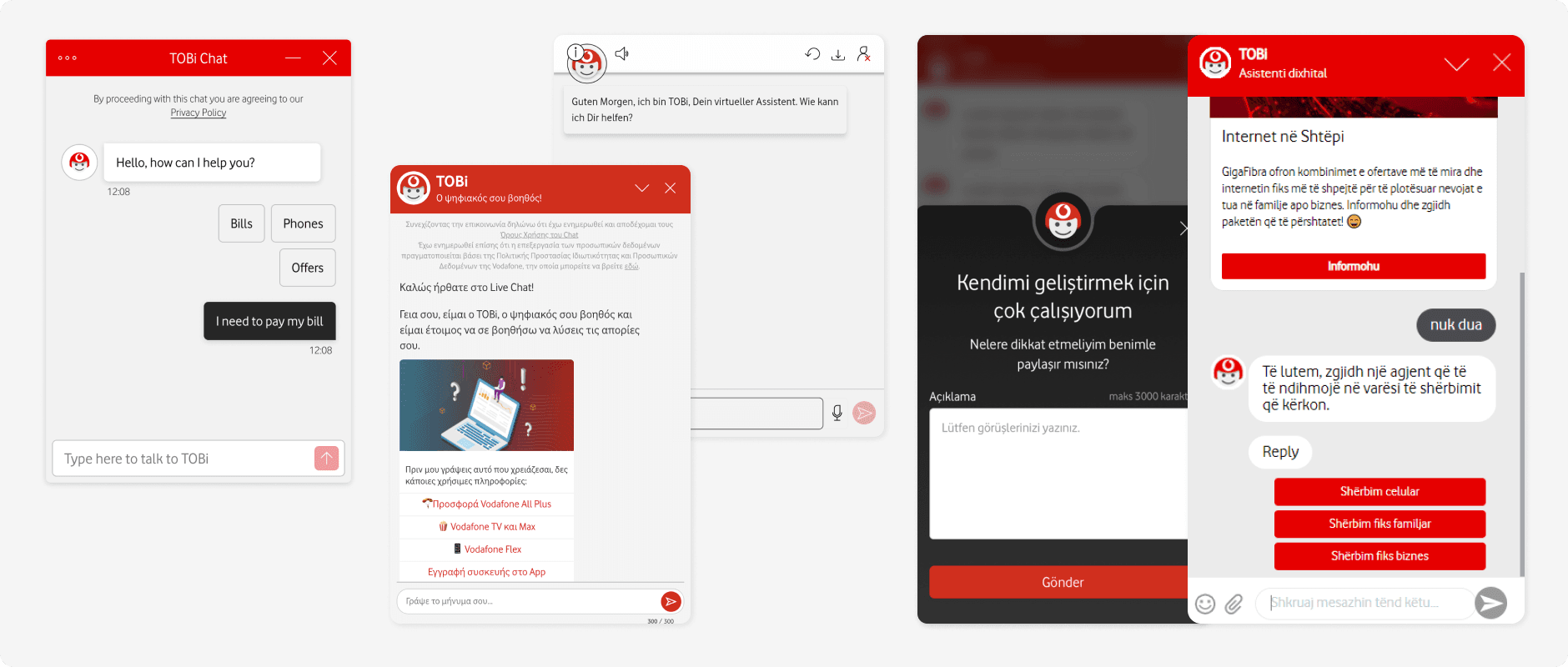
TOBi interfaces varied across markets, creating inconsistency in both UI and experience.
What I Did
I led the effort to define a unified UI approach for TOBi across markets. This involved:
Auditing existing implementations across different regions
Identifying common patterns and inconsistencies
Defining a core set of reusable UI components and interaction patterns (new frame, header, input field, menu etc.)
Creating a scalable set of assets that could be adopted across markets (billing cards, form cards etc.)
Working closely with the design system team to ensure alignment with Vodafone’s standards
Collaborating with product, engineering, and regional teams to support adoption
Leading QA and working closely with engineers to ensure high-quality, pixel-accurate implementation
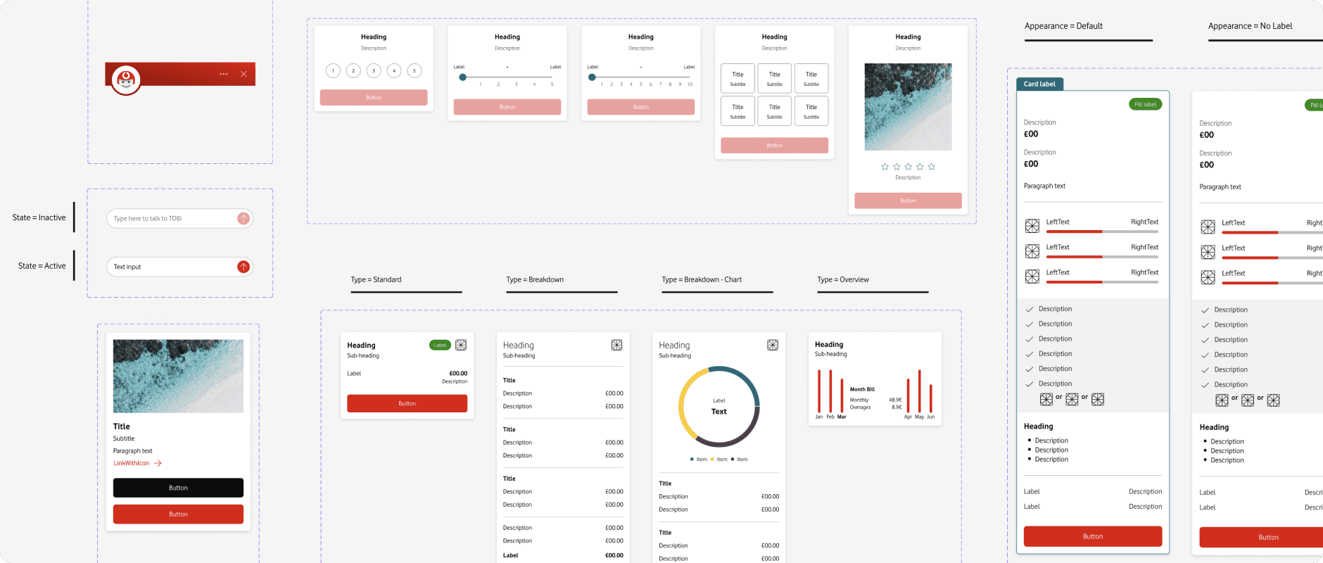
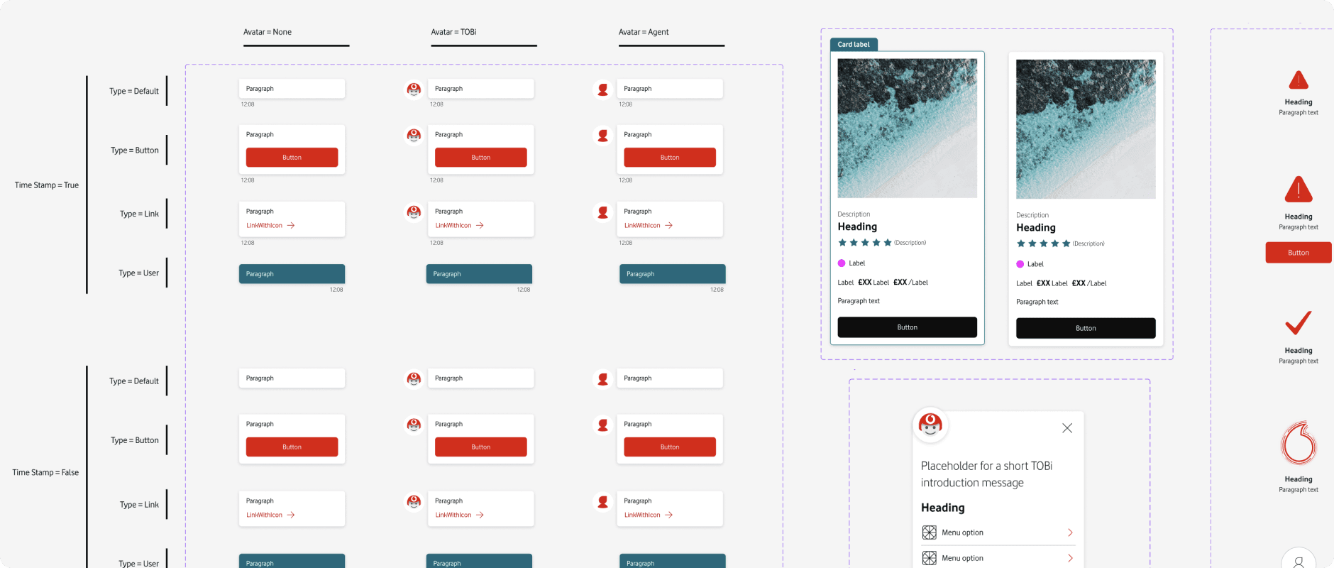
Core components designed for the TOBi single UI and integrated into Vodafone’s design system.
Solution
The outcome was a single, unified UI framework for TOBi that could be used across multiple markets. This brought greater consistency to the user experience while still allowing for flexibility where needed. It also reduced duplication and made it easier for teams to design, build, and scale new features.
The system was designed to be reusable and adaptable, supporting both current needs and future expansion of the product.
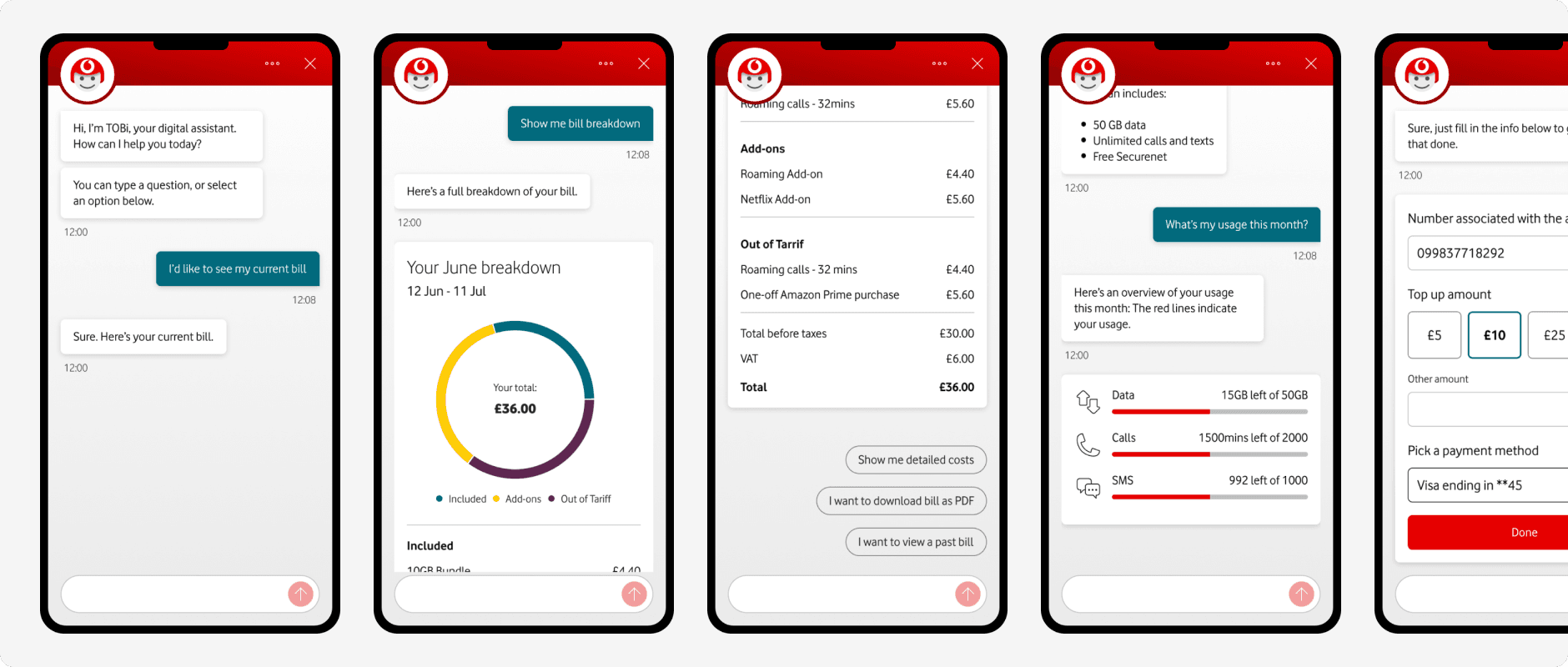
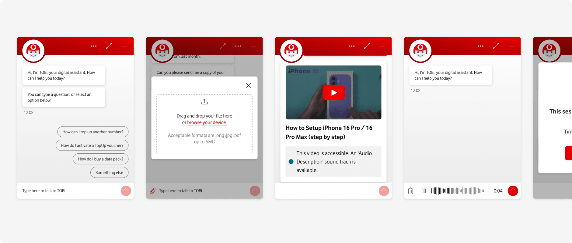
A unified UI across mobile and web, bringing consistency and scalability to the TOBi experience.